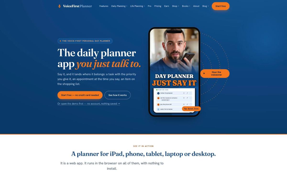
HomeThe voice-first personal day planner, from the beginning.Open Home →Daily PlanningFocus, tasks and appointments — the whole day on one page.Open Daily Planning →Life PlanningAll five parts, and how they connect.Open Life Planning →ShopThe workbooks, the books and the research paper.Open Shop →PricingFree to start. Every plan, side by side.Open Pricing →Earn25% recurring, rising to 40%.Open Earn →